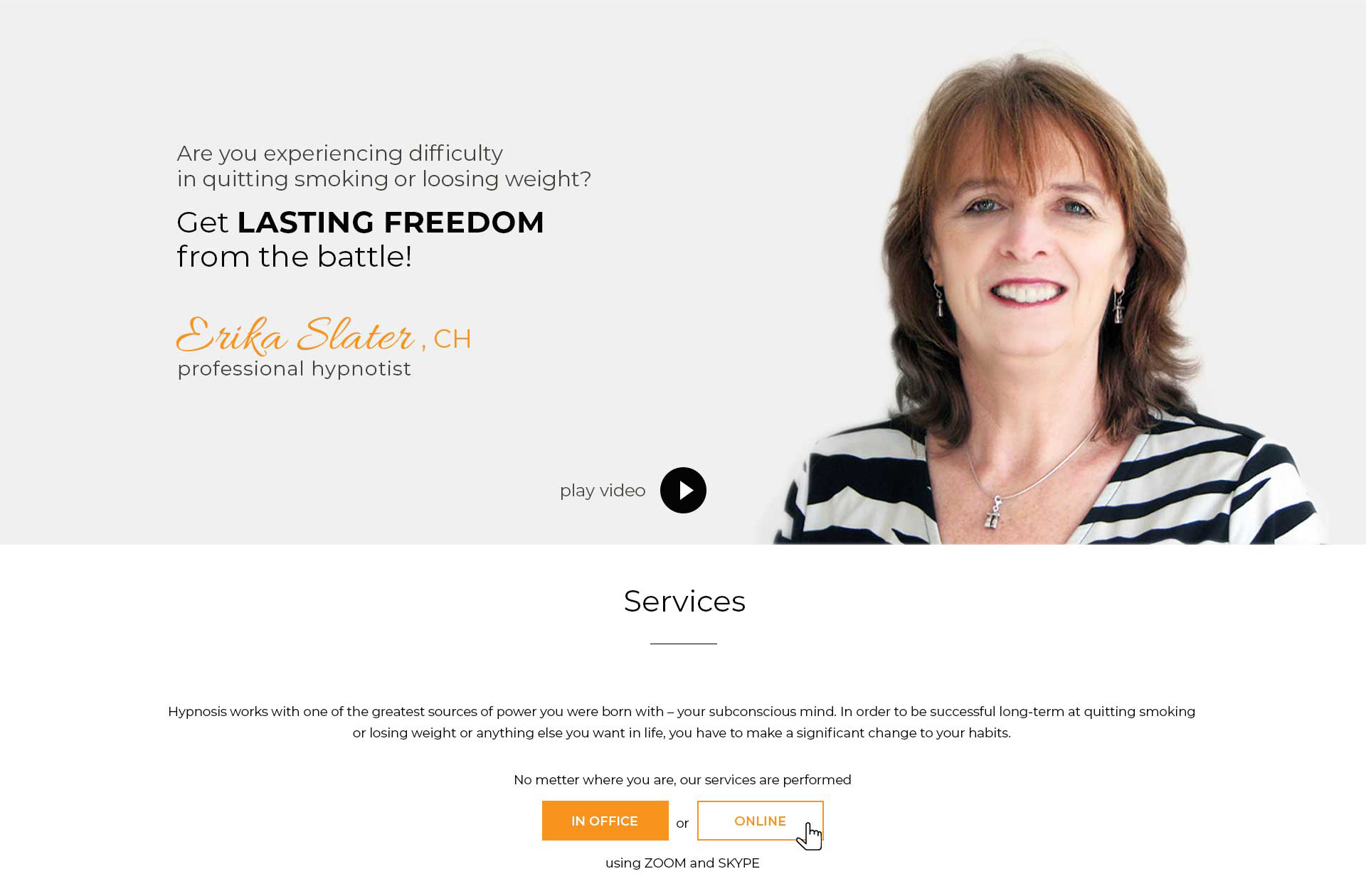
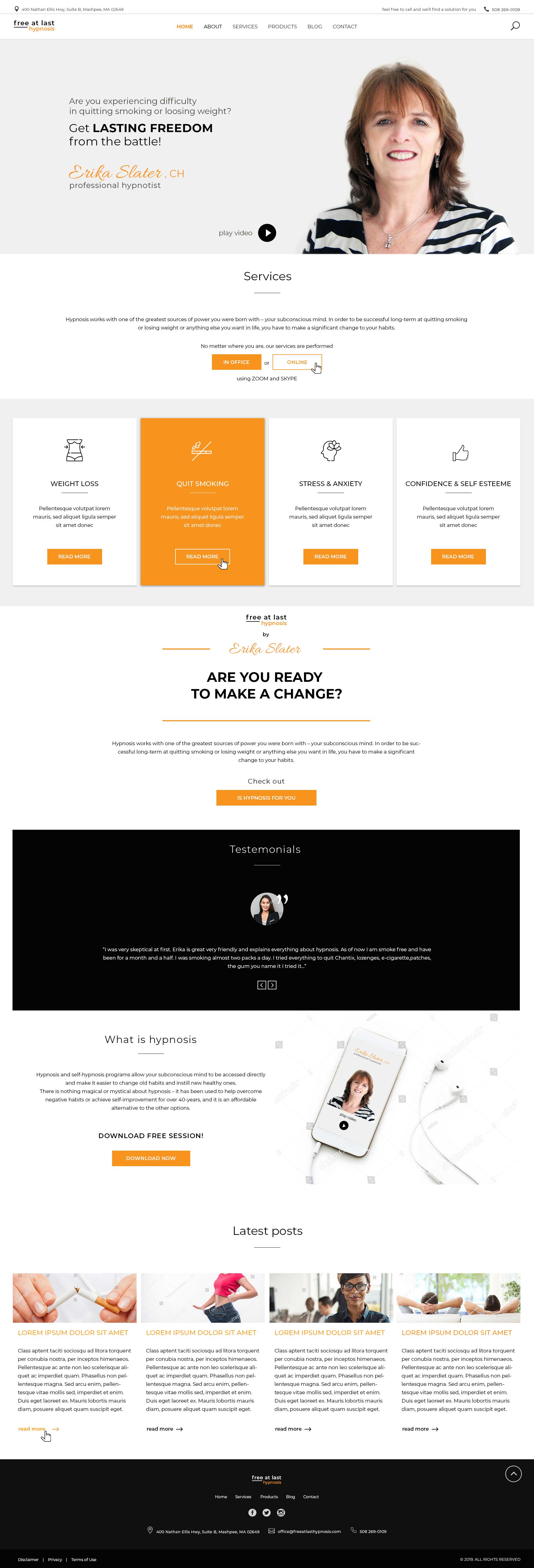
As I was researching competitors I saw that in this niche there are a lot of presentations that look cheap and overcrowded. I realized that the main thing for homepage design for hypnotherapist is to create design which will clarify what hypnosis is and give people confidence in the professional service.
First of all I wanted to present Erika in the right way, so I needed right image. After retouching the image to look clear and to show Erika’s positive attitude, it was easy to me to choose right fonts for the website. Whenever it is possible, I use Google fonts and that was the case here as well. Combining Sans serif font as primary with handwritten for signature, using different font weights, banner looks light and draws attention of the user on different parts of text.


